Student Journalists:
Fueling Local News
About the Project
-
The purpose of the "Student Journalists: Fueling Local News" initiative was to advance research and public knowledge about the decline of independent journalism in the United States. By examining the symbiotic relationship between student journalism and local journalism in underserved regions, as well as identifying areas requiring intervention, this initiative laid the groundwork for individuals interested in delving deeper into the landscape of independent journalism in the United States.
-
Landing page site
Slide deck design
Report design
Interactive map design
-
Art Director: Isabel Arnold
Graphic Designers: Isabel Arnold, Lucy de Greling, Ella Terran
Account Supervisor: Valentina Scarduelli
Project Manager: Rylie Pryor
I worked on this project as a component of my graphic design and art direction co-op with The Agency at UF. To learn more about my experience, click here.
-
Figma, Adobe InDesign, Adobe Photoshop, Felt (interactive map software), Excel, Google Sheets, Webflow (website builder)
Inspiration & Conceptualization
The client was drawn towards a fusion of clean, tech-oriented web aesthetics and more traditional newspaper- oriented aesthetics. In specific, they liked bold serif fonts and structured layouts featuring rotating blocks of text and images. However, they wanted to avoid a sense of detachment, sterility or inapproachability.

Tech-Oriented Inspiration
Newspaper-Oriented Inspiration
Example Color Palettes
In response to the client's input on inspiration, we developed a preliminary style guide. Deviating from a stark white, we opted for a warmer cream hue as the primary background color. We explored several design directions and crafted example color palettes, which we then presented to the client for further consideration and feedback.

Web Block Examples
Creating a Style Guide
Following client feedback, we finalized a direction and style guide for the project. Our color palette balanced warmer tones to infuse warmth and prevent the page from feeling excessively clinical, while incorporating cooler hues to evoke the desired tech-savvy and professional atmosphere.
Chosen Fonts & Colors

Web Block Examples
Web Design
Armed with our newly established style guide, we started constructing the full designs for the landing page. We consistently applied the guiding principles, infusing elements reminiscent of newspapers while ensuring ample white space and vibrant colors to evoke an inviting yet authoritative feel.
In-Progress Landing Page Example

In-Progress Landing Page Example
For instance, we introduced a dedicated section featuring individual team member photos and bios, imparting a human touch to the initiative. These elements were thoughtfully organized into tidy dropdown menus and seamlessly integrated sliding photo displays, maintaining a balance between approachability and professionalism.

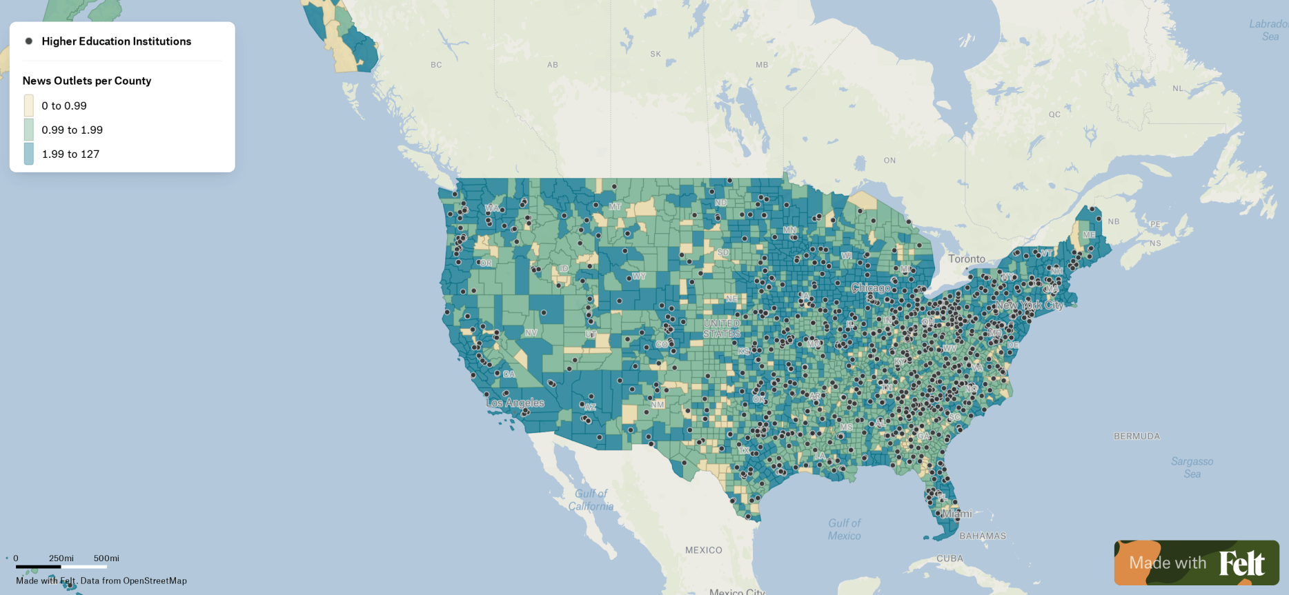
One integral aspect of the design was the incorporation of custom interactive maps. Utilizing the Felt tool, I created these maps by overlaying various datasets organized into spreadsheets. Integrating these maps into the landing page enabled viewers to click through them individually, facilitating a deeper exploration and comprehension of the impact on local journalism across the United States.
Interactive Map Example; Click to Explore

Video Walkthrough of Landing Page
Throughout the site, we used various repeating stylistic elements including dropdown menus and numbered columns, drawing loose inspiration from traditional newspapers but enhanced with clean lines for improved readability and a contemporary aesthetic.
Click map above to interact in a new tab; view video walkthrough of website left .
Report and Slide Deck Design
The report and slide deck were designed with the same principles and goals in mind as the landing page: to create an inviting, professional and impactful way to view essential data about the decline of local journalism in the United States. It was important that the style stay consistent, and that the text be broken up effectively by numbered sections, data, and photos.
View and click through report right and deck below. Visit the website and download report here.
Print Report; Click Arrow to Flip Through


